
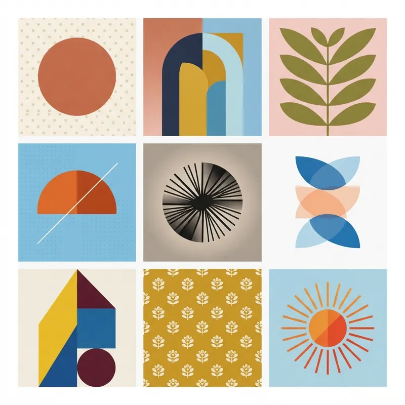
A nine-box layout that gives every element equal visual weight — built for feeds and mood boards.
Key traits
- Grid-based
- Ordered
- Symmetrical
Origins
The 3×3 grid is a simple nine-cell layout that organizes images or ideas into a balanced square. Grid systems have a long history in design, but this specific format became popular in the 2010s with social media feeds and mood boards. Its constraints make it useful for portfolios, boutique branding, and apparel, where a set of images needs to read as one composition.
Visual language
Nine equal cells form a square, usually separated by narrow gutters or no gaps at all. Each cell carries one image, object, or short text fragment. The challenge is coherence: color, scale, and subject matter must vary without breaking the whole. Repetition, cropping, and a shared palette create rhythm. The layout can be strict or subtly broken, but the grid remains legible.
Palette and type
The grid often uses a limited palette so the nine panels feel related. Color may repeat across cells or build a gradient. Typography is minimal, usually a small caption, label, or centered title; the images do most of the work.
What it signals
The 3×3 grid signals order, curation, and completeness. It can feel elegant and collectible, or repetitive when every cell is the same kind of image.
Where it works
It works for Instagram feeds, portfolio previews, mood boards, lookbooks, packaging, and brand campaign grids. It is less suited to long-form content or interfaces that need variable hierarchy.
Related styles
Sources
- Kittl — Detailed visual guide accessed 2026-10-21